7 UX Features Tourism Websites Need for More Bookings
By Tomahawk on

Your website might be attracting plenty of visitors, but if they're leaving without booking, your user experience (UX) could be letting you down. The good news? Small improvements often have a surprisingly big impact on direct bookings. In this article, we'll share seven UX features that help turn more website visitors into paying guests.
We design tourism websites with a focus on user experience and converting visitors to book. In this article, we'll walk through the seven UX features that make the biggest difference for tourism operators looking to boost direct bookings and reduce reliance on OTA commissions.
Quick guide: 7 UX features that drive bookings
- Mobile-first responsive design: Captures the majority of travel traffic with fast, thumb-friendly layouts
- Clear call-to-action (CTA) buttons: Guides visitors toward booking with visible, well-placed prompts
- Simplified booking flow: Reduces drop-offs with fewer steps from interest to confirmation
- High-quality imagery and video: Creates emotional connection and builds trust in your experience
- Real-time availability: Shows accurate dates and pricing to eliminate guesswork
- Social proof integration: Builds confidence through reviews, ratings, and testimonials
- Fast page load speeds: Keeps impatient travellers engaged instead of bouncing
1. Mobile-first responsive design
Mobile devices now account for the majority of travel research and browsing sessions. A 2025 analysis by Ulan Software found that mobile drives approximately 65% of travel website visits, yet mobile conversion rates sit significantly lower than desktop. This gap represents a massive opportunity for tourism operators who get mobile right.
A mobile-first approach means designing your website for phone screens first, then scaling up for tablets and desktops. This ensures your most important elements like booking buttons, contact details, and key imagery display perfectly on smaller screens without requiring pinching or horizontal scrolling.
Imagine someone researching your tour while waiting at the airport, or comparing accommodation options from the back seat of a campervan. If your website isn't effortless to use on mobile, they'll quickly move on to one that is.
Mobile-first design features:
- Touch-friendly navigation: Large tap targets and thumb-zone-optimised buttons make browsing effortless on phones
- Compressed images with lazy loading: Visual quality stays high while pages load quickly on mobile networks
- Sticky booking bars: The "Book Now" button remains visible as visitors scroll through your content
- Simplified forms: Mobile-optimised fields with auto-fill support reduce typing frustration
- Swipeable galleries: Intuitive touch gestures let travellers browse your images naturally
Benefits:
- Captures the largest segment of travel traffic with an optimised experience
- Improves search engine rankings since Google prioritises mobile-friendly sites
- Creates consistency across all devices, strengthening brand perception
2. Clear Call-To-Action Buttons That Guide Visitors to Book
A well-designed CTA button can be the difference between a booking and an abandoned session. Every page on your website should answer one simple question: What do you want visitors to do next? Whether it's "Book Now", "Check Availability" or "Get in Touch", your call-to-action should be obvious, easy to find and impossible to miss.
Position your primary CTA "above the fold" so they are visible immediately when the page loads without scrolling. Use contrasting colours that stand out from your page design, and keep button text action-oriented. "Book Now," "Check Availability," or "Reserve Your Spot" all tell them exactly what will happen when they click.
Call-to-action features:
- Above-the-fold placement: Visitors see the booking option within three seconds of landing on your page
- Contrasting colour palette: CTAs stand out visually from surrounding content without clashing with your brand
- Action-oriented language: Words like "Book," "Reserve," and "Secure" create urgency and clarity
Benefits:
- Removes guesswork about how to proceed with a booking
- Creates clear visual hierarchy on each page
- Drives visitors into the booking funnel from multiple touchpoints
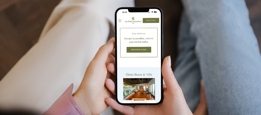
3. Simplified Booking Flow for Quick Conversion
Every additional step in your booking process creates an opportunity for visitors to abandon. Research shows that each extra field in a booking form can reduce completion rates by up to 20%. Tourism operators who streamline their booking flow see direct improvements in conversion rates.
Aim for the minimum number of steps necessary to collect essential information. A progress indicator helps to understand where they are in the process and what's coming next. Auto-saving visitor progress means they can return later without starting over if they need to check dates with a travel companion.
Simplified booking features:
- Progress indicators: Visual bars show how many steps remain, reducing uncertainty
- Guest checkout options: Allow bookings without requiring account creation
- Minimal form fields: Request only essential information at the booking stage
Benefits:
- Higher completion rates when faced with fewer barriers
- Faster booking times improve overall user satisfaction
- Reduced cart abandonment throughout the funnel
4. High-quality Imagery & Video for an Emotional Connection
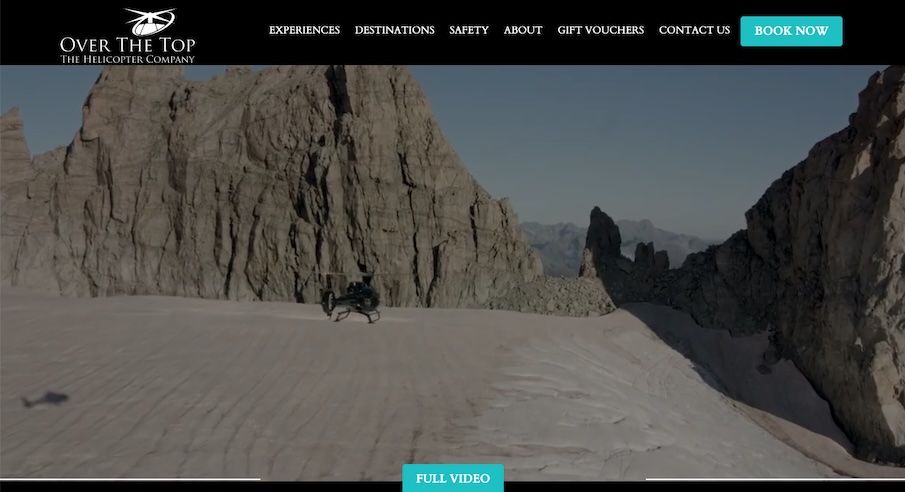
Tourism is an inherently visual industry. Before someone books your experience, they're imagining themselves in it. They're picturing the sunrise from your lodge, the thrill of the jet boat, or the glass of wine overlooking the vineyard. Great photography and video help them picture themselves there, and that's often what turns interest into action.
A hero image is your single most compelling visual and should appear immediately when your homepage loads. This is your three-second chance to capture attention and inspire the dream of visiting. Video takes this even further, with research suggesting viewers remember 95% of a message when watching video compared to 10% when reading text.
Tomahawk's creative services team helps tourism operators capture and showcase imagery that resonates with their target travellers.
Imagery and video features:
- Hero images: Full-width, emotive visuals that capture the essence of your experience
- Short-form video: 30-60 second clips that bring your tours and accommodation to life
- Optimised galleries: Quick-loading image collections visitors can browse easily
- Authentic photography: Real images of your property and experiences rather than stock photos
- Alt text descriptions: Accessibility-compliant image labels that also support SEO
Benefits:
- Creates immediate emotional engagement with potential guests
- Differentiates your experience from text-heavy competitor sites
- Builds trust through authentic visual storytelling
5. Real-time Availability to Eliminate Booking Uncertainty
Nothing frustrates a potential guest more than selecting dates, filling out forms, and then discovering their preferred option isn't available. Real-time availability displays solve this by showing accurate, up-to-the-minute booking status before they invest time in the checkout process.
Greyed-out unavailable dates prevent wasted clicks. Clear pricing that updates based on selected dates and options removes the uncertainty that causes visitors to abandon their search. When travellers can see exactly what's available and what it costs upfront, they move through the booking process with confidence.
Real-time availability features:
- Availability status: Visitors instantly see which dates are open
- Dynamic pricing display: Costs update automatically based on dates, room types, or group sizes
- Inventory counters: "Only 3 spots left" messaging creates urgency and transparency
Benefits:
- Eliminates frustrating dead ends in the booking journey
- Builds trust through pricing transparency
- Reduces enquiry volume for basic availability questions
6. Social Proof Integration to Build Booking Confidence
Travellers research extensively before committing to a booking, and reviews from past guests carry significant weight in their decision-making. Integrating social proof throughout your website, not just on a dedicated reviews page, reinforces credibility at every step of the customer journey.
Reviews don't just influence travellers, they're also valuable signals for search engines and AI-powered search tools, helping build trust and reinforce your credibility online.
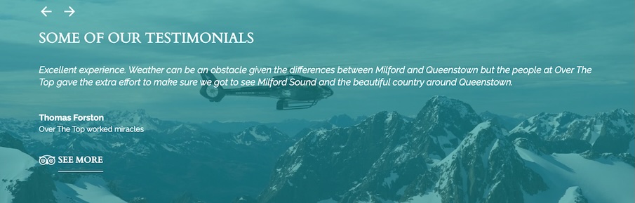
Feature testimonials near booking buttons where visitors are making their final decision. According to research cited by FareHarbor, 92% of consumers read online reviews before making a purchase decision.
Social proof features:
- Star ratings on key pages: Visual trust signals near pricing and booking options
- Testimonial snippets: Brief quotes from satisfied guests placed strategically throughout your site
- Review platform integration: Live feeds from Google, TripAdvisor, or industry-specific review sites
Benefits:
- Third-party validation builds trust more effectively than marketing copy
- Addresses common concerns and objections through real guest experiences
- Improves credibility with both human visitors and search engines
7. Fast Page Load Speeds to Keep Travellers Engaged
Website speed directly impacts both user experience and search engine rankings. Google considers page load time a significant ranking factor, and even a one-second delay can reduce conversions. Travellers researching on mobile connections or in areas with slower internet will quickly abandon sites that take too long to load.
Optimise images without sacrificing quality. Minimise code and leverage browser caching. A website UX audit can identify specific speed improvements tailored to your site's architecture. Tools like Google PageSpeed Insights reveal exactly where load time issues originate.
Page speed features:
- Image compression: Reduced file sizes without visible quality loss
- Content delivery networks: Faster loading for international visitors
- Clean code architecture: Streamlined scripts that don't slow page rendering
- Lazy loading: Images load as visitors scroll rather than all at once
- Caching strategies: Returning visitors experience faster load times
Benefits:
- Improves search engine rankings and organic visibility
- Reduces bounce rates from impatient visitors
- Creates smoother experience across all connection speeds
How do UX improvements affect direct booking revenue?
Direct bookings represent the most profitable channel for tourism operators because they avoid OTA commission fees that can range from 15% to 25% per transaction. A 2025 SiteMinder analysis found that direct booking revenue can be up to 60% higher than OTA bookings when accounting for commission savings.
The beauty of good UX is that it keeps working for you. Every visitor who finds it easier to browse, compare and book increases the return on all your other marketing efforts, whether they're coming from Google, social media, email marketing or AI Search. A simplified booking flow that increases conversions by even a few percentage points translates to meaningful revenue gains across hundreds or thousands of monthly visitors. Mobile optimisation captures traffic that might otherwise book elsewhere. Social proof builds the trust that converts browsers into guests.
A real example for Over The Top Helicopters
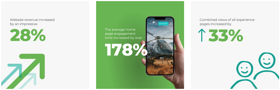
Our work with Over The Top Helicopters demonstrates this impact, after implementing UX improvements, the company saw:
- website revenue increase by 28% compared to the same period the previous year
- average home page engagement time increased by over 178%, and
- combined views of all their experience pages increased by 33%.
What's the first step to improving your website UX?
Start with a UX audit that examines your current booking flow from a visitor's perspective. Walk through the entire journey from landing page to booking confirmation on both mobile and desktop. Note where you encounter confusion, delays, or unnecessary steps.
Common quick wins include repositioning your "Book Now" button for better visibility, compressing oversized images, and adding testimonials near key decision points. More substantial improvements like real-time availability integration or mobile-first redesigns typically require partnering with a digital marketing team experienced in tourism.
Track your current conversion rates before making changes so you can measure the impact of each improvement. Tools like Google Analytics show where visitors drop off in your booking funnel, helping you prioritise which UX elements to address first.
FAQs about UX features for tourism websites
What is UX design for tourism websites?
UX (user experience) design for tourism websites focuses on how visitors interact with your site throughout the booking journey. Tomahawk creates UX that guides travellers from initial interest to confirmed booking with minimal confusion or obstacles. This includes navigation, visual design, form layouts, and mobile responsiveness.
How much do UX improvements cost for a tourism website?
Costs vary significantly depending on scope. Simple changes like button repositioning or image compression can be minimal investments with immediate returns. Larger projects involving booking system integration or full mobile redesigns require more substantial budgets. Tomahawk offers consultations to scope improvements matched to your goals and budget.
How long does it take to see results from UX changes?
Some improvements show impact immediately like repositioned CTAs can increase clicks within days. Larger changes like mobile optimisation may take weeks to fully reflect in booking data. We recommend allowing 2-3 months to accurately measure the impact of substantial UX improvements, as tourism booking patterns can fluctuate seasonally.
Should I rebuild my entire tourism website or make incremental UX improvements?
The answer depends on your current site's foundation. If your website runs on outdated technology that doesn't support mobile responsiveness or modern booking integrations, a rebuild may be the most effective path. For sites with sound technical architecture, incremental UX improvements often deliver faster returns.
How does mobile UX affect my tourism website's search rankings?
Google uses mobile-first indexing, meaning it primarily evaluates the mobile version of your site when determining search rankings. Poor mobile UX can hurt your visibility in search results even if your desktop site performs well. Tomahawk builds tourism websites with mobile performance as a foundational priority.
Why is Tomahawk is a leading choice for tourism website UX?
At Tomahawk, we've spent more than 30 years helping tourism businesses across New Zealand, Australia and the Pacific create websites that not only inspire travellers but convert them into paying guests.
If your website isn't converting as well as you'd like, chances are you don't need to start from scratch. A few smart UX improvements could make all the difference. We'd love to help, get in touch to kick off with a UX audit!
Listen to Sound Advice about UX Design Features
Read more articles
Tomahawk Becomes First New Zealand Agency Named Finalist in Global Skift IDEA Awards
By Tomahawk |
We are proud to share that we have become the first New Zealand agency to be named a finalist in the global Skift IDEA Awards, recognised in the "Industry Innovators: Tourism" category for our work creating the new Tonga Tourism...
Tomahawk Launches Sound Advice for Tourism
By Tomahawk |

We have officially welcomed our newest team member, Chip, an AI-generated T-Hawk with a smooth voice and endless enthusiasm for tourism and digital marketing. Well...technically he isn't that new. Chip was assembled somewhere in...
