Why Fonts Matter More Than You Think
By Pallavi Karambelkar on
Typography is often one of the most overlooked yet influential elements of a tourism brand. When thinking about branding, one often tends to focus on logos, colours, photography, or storytelling. The fonts, however, are often overlooked or taken for granted. I have always believed that typography is the invisible thread that ties all your brand communications together and creates a sense of trust when used consistently. For tourism businesses, where experiences are often sold long in the ‘Dream’ stage, before they are lived, typography becomes a powerful tool for setting expectations.
Font Terminology
Before we talk about the importance of typography, let's clear up some terminology. You may have heard words like fonts, font family, typeface, type, and typography being used interchangeably. While there are subtle differences between them, they all relate to the visual style of the words used throughout your brand. Don't get too caught up in the jargon, we're simply talking about how your brand communicates visually through the style of its written words and why those choices matter more than you might think.
Every Typeface Communicates Something
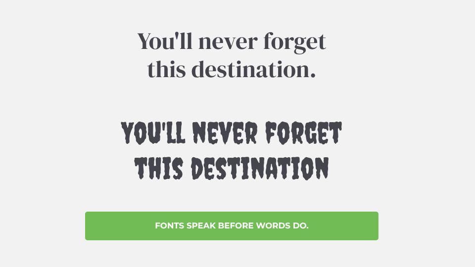
Some fonts feel refined and sophisticated. Others feel adventurous, contemporary, welcoming, or playful. These impressions are formed almost instantly at a sub-conscious level, often before a visitor has read a single word. That’s the power of typography.
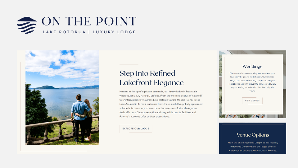
A luxury lodge positioned around sophistication and heritage will communicate very differently through typography than a family destination focused on exploration and approachability. While the words may describe the experience, typography helps establish the emotional context.
A wellness retreat may benefit from typography that feels calm and understated, while a brand built on expertise, knowledge, and discovery may require something more confident and authoritative. The goal is not simply to choose an attractive font, but to choose one that supports the overall brand strategy.
Below are examples of how different font styles have been used to communicate distinct personalities and appeal to different audiences.
.png)
.png)
Does My Brand Font Need to Match My Logo?
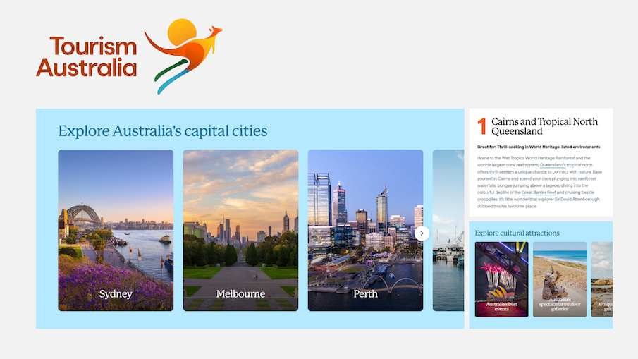
A common misconception is that the font used in a logo must also be used across the entire brand. While there should be a visual relationship between the two, they don't need to be identical. In fact, many successful brands use a custom or highly distinctive typeface in their logo and pair it with more functional fonts for websites, brochures, advertising, and day-to-day communications. The role of a logo is to be memorable and unique, whereas brand typography needs to work hard across a wide range of applications and remain easy to read. The most effective typography systems focus on creating consistency and cohesion rather than exact matching, ensuring every element works together to support the overall brand experience.
Typography is not limited to a logo or homepage. It guides users through websites, improves readability, supports accessibility, and helps guests navigate information. Whether someone is researching accommodation, comparing experiences, or making a booking, typography contributes to the overall user experience. The most successful brands balance personality with functionality, ensuring typography remains both beautiful and practical.
Below are examples of leading brands whose primary typography is not the same as the font used in their logo.
![]()
![]()
Final Thoughts
Before a guest books a stay, reserves a table, or plans a journey, they begin forming perceptions about your brand subconsciously through what they see. The typography used across your website, printed collateral, digital ad, or social media post plays a significant role in shaping those perceptions. When chosen strategically, typography becomes more than a design decision. It becomes an integral part of how guests experience and remember a brand.
ABOUT THE AUTHOR
Pallavi Karambelkar | Creative Lead
Read more articles
Marketing Mythbuster #5: Brand is Just a Logo
By Tomahawk |
When many people hear the word “brand”, they immediately think of logos, colours, fonts, or maybe a slick-looking website. And while those things are important, they are only the surface layer of branding.
Your brand is not your...
7 Website Design Features That Drive Bookings for Humans and AI
By Michelle Ackers |

We often talk about how tourism websites should be designed with one goal in mind: attract visitors from search engines (mostly Google) and convert them into bookings. While that objective remains the same, the way travellers...
