When the client first came to us, their business was well established as a service but the brand itself had little visibility. This was mainly due to the lack of brand personality from a visual design perspective. The brief was to completely redefine the brand’s identity, the associated visuals, and the most exciting of all – redesign the yellow bus!
![]()
![]()
We developed a strong, friendly and striking brand for this logo by owning the “yellow” and really putting it out there. We retained the paper plane icon to keep a connection with the original brand. We used a bright shade of canary yellow with contrasting black and white with a bold font to create this brand’s unique and memorable personality.
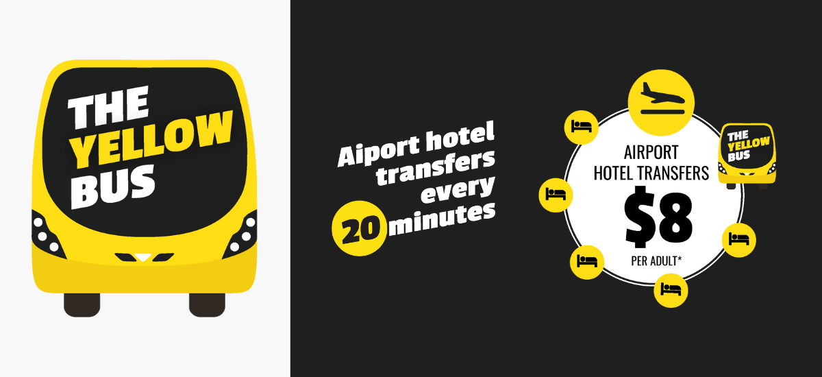
We created a range of visuals and infographics that enhance the brand further and also provide more information to the users about the service itself. These graphics are used across all collateral to keep consistency and brand recognition high.
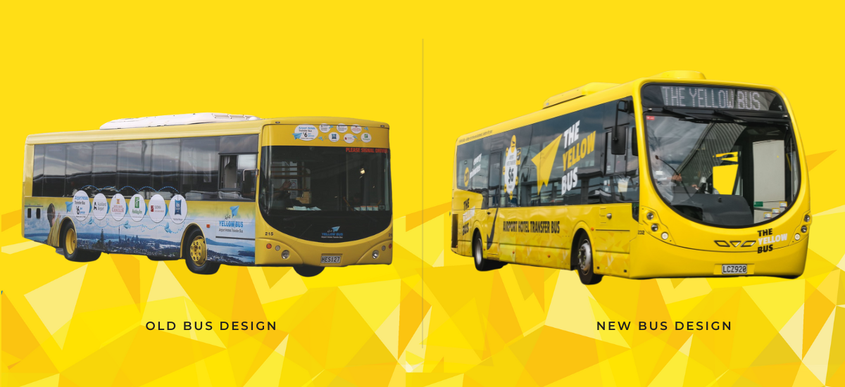
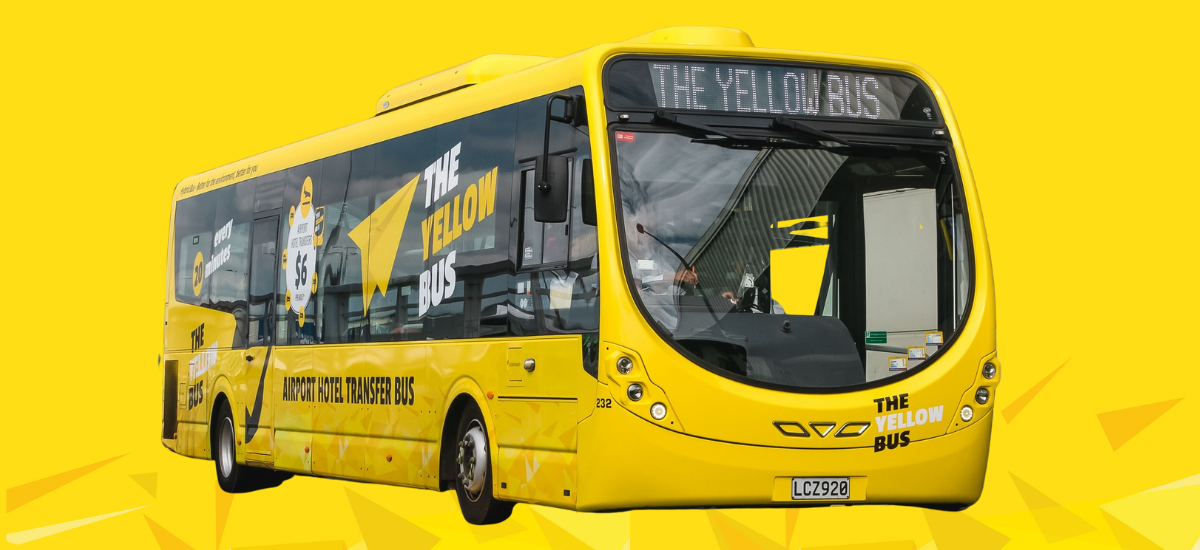
The old bus had very cluttered graphics and imagery that diluted the personality of the brand significantly. It was essential for the new bus to stand out, be striking and recognisable from a distance, and have a personality that resonates with its audience. We carried forward the visual strategy of “owning the yellow” and created an eye-catching bus that will turn heads as it drives along, creating a bold brand presence and recognition.
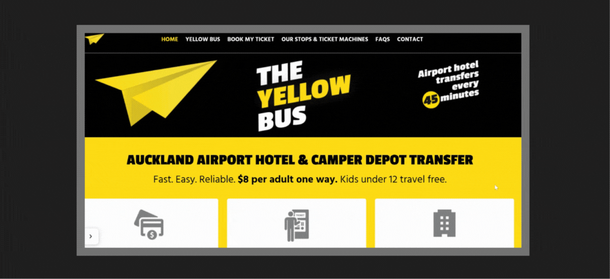
The website reflects the branding immaculately and is a simple and user friendly platform to get more information about the service and book tickets.