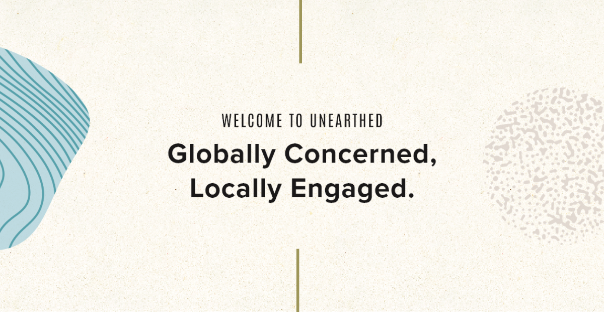
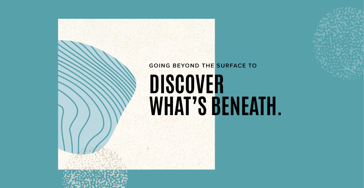
The brief was to develop a brand that personifies the product and reflects it’s core values. We coined the brand name “Unearthed”. Unearthed is about discovery: Discovery of new people and new places—and discovery of self. Unearthing comes from exploration. It’s deep, going beyond the surface to discover what’s beneath. It has environmental and global connotations. It’s real and it’s raw.
![]()
![]()
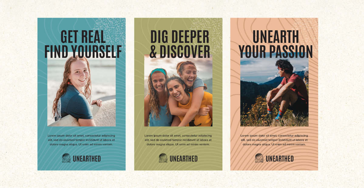
To capture the soul of this brand, we developed a logo that is a fusion of visuals of the earth’s terrain and topographical lines + the shape of the letter U (inverted) + a fingerprint mark. The topographical lines represent not only the peaks and valleys of the terrain but also the ups and downs that the students experience while on their journeys with Unearthed. The fingerprint represents the unique identities that the students bring to the experience as well as their own unique mark that they carry on these journeys. The flexible lines create waves of adventure and represent the nature of relationships that the students will form with their peers as well as with mother earth. The lines represent exploration, curiosity and discovery.
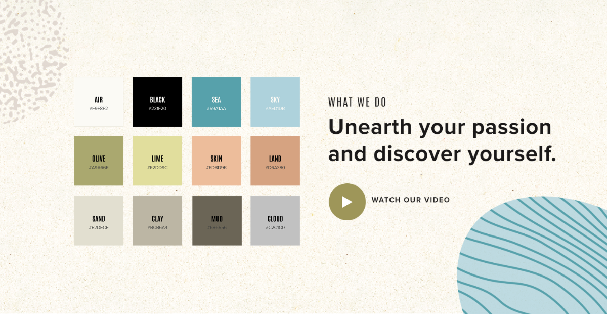
The colours used in this brand concept are slightly muted and mature. They are close to the colours of natural landscapes and have a sense of maturity and authenticity. The olive green, the blue the beige and the dull peach create a visual environment of calmness, warmth and assurance.
The font chosen is a narrow, bold and assertive one. It adds to the assertiveness and reliability of the brand Unearthed. The uppercase usage of the font in headlines creates confidence and boldness in the messaging.